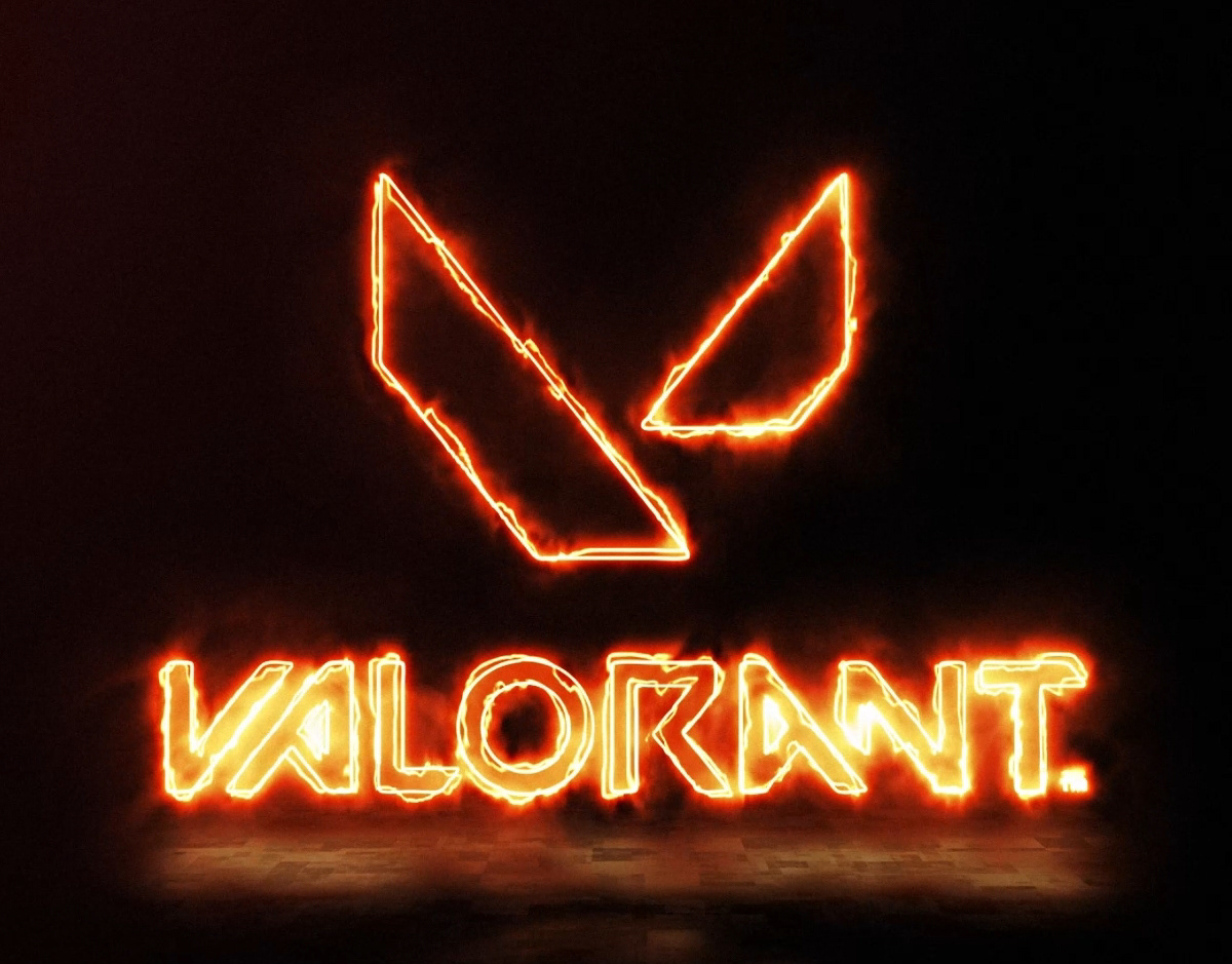
for this logo i used a variety of techniques to achieve the final animation. by utilizing the basic principles of motion. (anticipation, squash and stretch, etc.) i was able to give each character a level of cartoonish whimsical charm. for the "o" i used trim paths to make the letter stretch along the spline to make them appear as though they are bouncing into the position.
As for the "L" I thought it would be neat to have it slide in, so i used the slant effect to make it appear as though it's tilting with the momentum of the motion. when combined with proper timing it makes the animation appear more dynamic.
